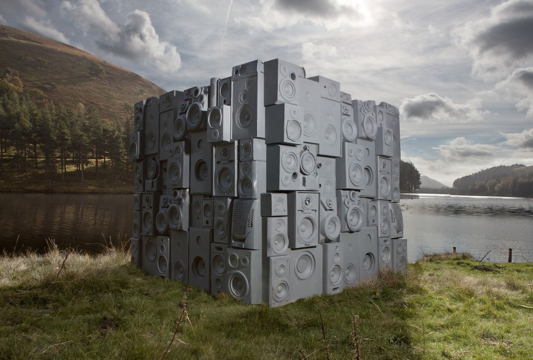
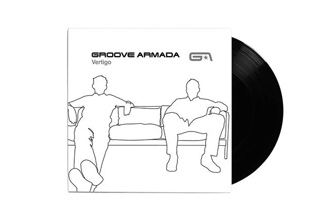
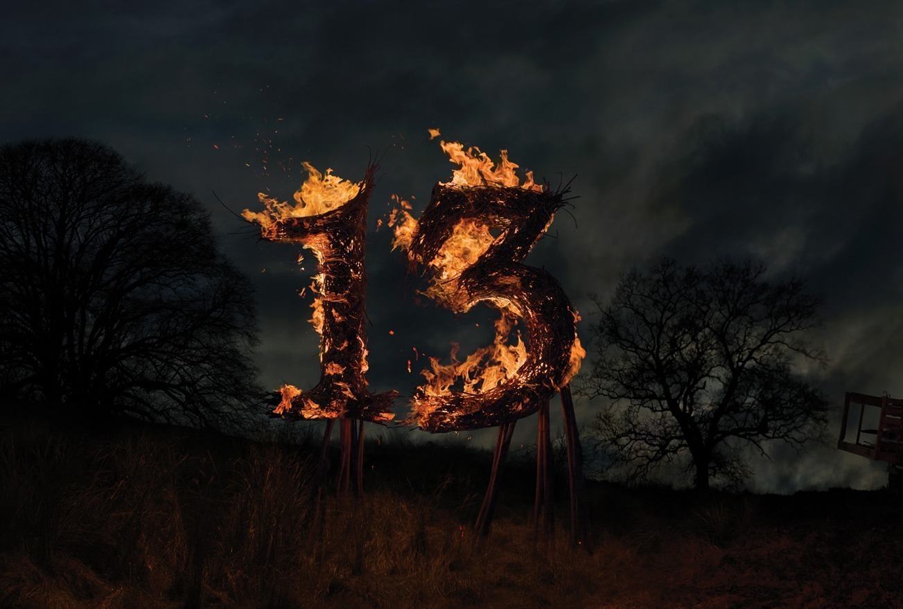
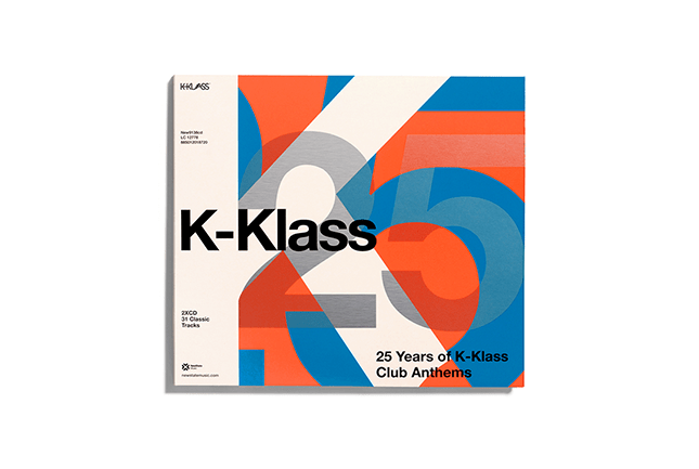
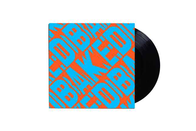
+44 (0)20 7644 6581
studio@zipdesign.co.uk
Zip is currently working on break through artist Maverick Sabre’s campaign. Here’s a sneak peek at the promos. Stay tuned for the commercial artwork.
Adrian Shaughnessy approached us to create a ’Remix’ of Anton Corbijn’s symbol for the new Depeche Mode album, Sounds of the Universe. We took Anton’s original drawing and created a set inspired by black holes and gravity.
A fresh new concept and approach to a fresh new Tom Jones album. Large clean typography combined with a cinematic photo shoot ensured a coherent transition through album, singles and collateral.
“We thought after last year’s very successful Cream Ibiza campaign, which Zip were also responsible for, that this year’s would be difficult to top but Zip definitely pulled it out of the bag. Zip really did their homework and the choice of using lasers as the main theme for the campaign was bang on the money. We have the most amazing lasers at Cream Ibiza in Amnesia. The campaign is definitely the most stand out look for any club or promoted night on Ibiza this year.” Gill Nightingale, Cream
On the success of the previous years work, Zip once again reworked Defected’s output. Using girls to represent the varying styles of music we worked with an illustrator to manipulate the shots.
The home of soulful house music. Soul Heaven came to Zip to ignite something different into a musical genre which was becoming increasingly visually similar.
Zip designed the original Groove Armada logo, as well as the first album campaign ’Vertigo’. When the double act released their Greatest Hits album, we stepped up once more to produce a clean and iconic cornerstone to their output.
Saturday Night Lotion was launched as a scent, and later revealed as the latest Plumps album.
An iconic compilation idea created for Family Records. This series lives on today and Zip continues to produce the sleeves.
Family photo albums were the inspiration for The Little Ginger Club Kid. The special edition was packaged in a wire bound album.
Vertigo was the first release from Groove Armada. The sleeve is still seen as iconic today and the logo we created is still in use by the band.
We decided to break away from CGI on the latest Godskitchen compilation and embrace product prototyping. Resulting in a compilation that looks and feels a little different from the rest.
For the Saturdays’ debut album, Zip created an accessible pop brand. Running throughout the campaign we used a theme of black and white skin tones combined with bright clothes. The result is a strong and recognisable campaign for this band’s first album.
Sleeve designs for the band Cicada. We used the work of fine artist Eric Zener to capture the emotions described in the band’s brief.
Radio:Active is the 4th collaboration between McFly and Zip. We created ideas for a campaign with multiple levels. Zip went camping with the band for 2 days in Devon to get the shots we needed, we supplied designs for all parts of the project from the music to the website. The main album image we created as an animated packshot.
A greatest hits package with 2 different covers. Targeting a wide ranging audience. Zip created all formats including the accompanying DVD.
Concentrating on the strong branding of the Cream logo these 3D illustrations develop the concept into believable but fictional products.
Vibrant, fun, pop was the order of the day to introduce McFly to the world.
A series specialist music compilations focusing on more left field psychedelic artists from the featured genres. Zip worked closely with the ‘Strange’ music co-ordinator Miles Evans to produce the logo, illustrations, and packaging for this series.
Inspired by vintage 1920’s postcards. This album campaign for singer-songwriter, Catherine Feeny was shot entirely on out of date 35mm film stock. The result is a delicate and soulful set of images, combined with uncluttered typography.
Campaign commissioned by EMI for Glasgow band Make Model. Sets were constructed to represent corporate art. We created a generic graphic colour ’warp’ and interpreted the flat graphic into 3 dimensional spaces. most of the sets were then animated for alternative media purposes.
Bugged Out celebrated its 15th anniversary with this special package. ASCII art was used to highlight Bugged Out’s style of music: lo-fi tech.
A celebration of BBC Radio 1. This compilation tracks the success of the station from the beginning to the present day, using covers of classic tracks by contemporary artists.
Beth had a concept for this album that we helped her realise. A painting found in her grandmothers attic formed the front cover and her own illustrations were used on the booklet, to accompany a commissioned shoot.
Zip transformed Defected from a dance brand that blended in with the crowd, into a trend setter. The various styles we created for Defected were very successful.
The worlds introduction to Girls Aloud was met with widespread acclaim.
Waltzes for Weirdos was Grandadbobs debut album. It featured an eccentric dance pair on the album and drew on old wallpaper for singles inspiration.
A series created for the album and 4 singles. References were made to the track names with details illustrated into the images.
India Soundpad is an ambitious new project from the British Council and the University of Westminster’s Faculty Music label, aimed at generating a dialogue between the emerging alternative music scenes in India and the UK.
The re-design for this seminal 1975 album was chosen from five other ideas by the public. We liaised with Universal and discussed their market research feedback to get the sleeve into its final shape. This compilation remains the finest introduction to the Rolling Stones. It’s all-killer, no filler.
Go Audios explosive sound is represented in a series of exploded illustrations. Featuring the bands audio equipment.
When Southern Fried Records released their first ever compilation Zip was asked to step in. We designed and art directed the campaign with contributions from collage artist Peter Quinel.
Taking McFly’s graphics back to a pop edge for this campaign, we commissioned Ellis Parrinder who took some great underwater shots to bring to life the album title ‘Motion in the Ocean’.
Zip re-invented Stereo Sushi with a new logo and logo mark. The client wanted to appeal to an audience that was more hi-end lifestyle, something previous releases didn’t appeal to.
Remote are Roger Eno and Miro. They create sublime Balearica with a cinematic feel. Zip designed and art directed the first album campaign ’Opening Doors’, which spawned 2 singles. The logo was created using a bespoke Zip-designed typeface called ’remote’.
Wood block letters were used to invoke a sense of individuality and heritage for Nubreeds latest offering.